> ## Documentation Index
> Fetch the complete documentation index at: https://social-b97141fb-auto-generate-llmstxt.mintlify.site/llms.txt
> Use this file to discover all available pages before exploring further.
# Post Components
> Comprehensive post creation, editing, and content management components for rich social interactions
**Key Benefit**: Enable rich content creation and engagement with comprehensive post components supporting text, media, polls, mentions, link previews, and advanced accessibility features across all platforms.
## Feature Overview
The Post Components UIKit provides a complete suite of tools for post creation, editing, and content management. From rich media posts and interactive polls to advanced features like @mentions, link previews, and accessibility support, these components create the foundation for engaging social content experiences.
Create rich content with text, images, and videos. Support for **optional titles**, **mentions**, **hashtags**, and multiple attachments.
Engage users with text or **image-based polls**. Users can **change/remove votes** with customizable duration and multiple selections.
Real-time **livestreaming** with interactive chat and reactions, available in Livestreaming post in a community.
**Inline comments**, reactions, @mentions, and real-time interaction tracking for active discussions.
**Shareable deep links**, link previews, hashtags, and **gallery-to-post linking** for better content discovery.
Post editing, content moderation tools, and comprehensive management for all post types.
## Platform Support
| Feature | iOS | Android | React | React Native | Flutter |
| ------------------------------------------- | --- | ------- | ----- | ------------ | ------- |
| Create Text, Image, Video Post | ✅ | ✅ | ✅ | ✅ | ✅ |
| Edit Text, Image, Video Post | ✅ | ✅ | ✅ | ✅ | ✅ |
| Create Livestream Post | ✅ | ✅ | ❌ | ✅ | ❌ |
| Community Livestream with chat and reaction | ✅ | ✅ | ✅ | ❌ | ❌ |
| Create Poll Post | ✅ | ✅ | ✅ | ❌ | ✅ |
| Create Image Poll Post | ✅ | ✅ | ✅ | ❌ | ❌ |
| Update Poll Answer | ✅ | ✅ | ✅ | ❌ | ❌ |
| Report Post | ✅ | ✅ | ✅ | ✅ | ✅ |
| Comments & Reactions | ✅ | ✅ | ✅ | ✅ | ✅ |
| Recent Comment preview | ✅ | ✅ | ✅ | ❌ | ❌ |
| Mention | ✅ | ✅ | ✅ | ✅ | ✅ |
| Link Preview | ✅ | ✅ | ✅ | ✅ | ✅ |
| Brand User Post | ✅ | ✅ | ✅ | ❌ | ✅ |
| (Optional) Post title | ✅ | ✅ | ✅ | ❌ | ❌ |
| Hashtag | ✅ | ✅ | ✅ | ❌ | ❌ |
| Sharable Links | ✅ | ✅ | ✅ | ❌ | ❌ |
| Ads | ✅ | ✅ | ✅ | ✅ | ❌ |
| Alt text for Image Post | ✅ | ✅ | ✅ | ❌ | ❌ |
| Url Preview Removal | ✅ | ✅ | ✅ | ❌ | ❌ |
| Product Mentions in Text | ✅ | ✅ | ✅ | ❌ | ❌ |
| Product Tags on Media | ✅ | ✅ | ✅ | ❌ | ❌ |
| Product Carousel Display | ✅ | ✅ | ✅ | ❌ | ❌ |
| Edit Product Tags | ✅ | ✅ | ✅ | ❌ | ❌ |
**Legend**: ✅ Full Support | ❌ Not Available
## Post Types & Features
**Supported Content Types**
* **Text Posts**: Rich text content with optional post titles and free-form hashtags for better discoverability
* **Rich Media Posts**: Images and videos with enhanced display, and alt text support
* **Livestream Posts**: Livestreaming with interactive chat and reactions
* **Poll Posts**: Interactive polls with voting and real-time results
* Text-only polls with multiple choice options
* Image polls with visual voting options (supported on iOS, Android, React)
* Vote management - users can change or remove their poll votes
**User Interaction Capabilities**
* **Reactions**: Multiple sentiment expressions
* **Inline Comments**: Threaded conversations displayed directly under posts on feeds for improved engagement
* **Mentions**: @username functionality with notifications and user discovery
* **Sharing**: Content distribution with shareable deep links for posts
* **Poll Voting**: Interactive voting with the ability to change or remove votes before poll closes
**Enhanced Functionality**
* **Post Titles**: Optional titles for better post organization and context
* **Free-form Hashtags**: Add hashtags anywhere in post content for improved content discovery and categorization
* **Shareable Deep Links**: Generate and share direct links to specific posts for seamless navigation
* **Link Preview**: Automatic metadata extraction and display for URLs shared in posts
* **Link Highlighting**: Detect links using `AmityLink.index` and `AmityLink.length`, highlight matching text, and open `link.url` on tap
* **Gallery-to-Post Linking**: Community gallery media is linked to original posts, providing full context when viewing images
* **Brand User**: Professional/admin posting capabilities with enhanced visibility
* **Accessibility**: Comprehensive alt text support for images ensuring inclusive content
* **Moderation**: Content reporting and management for community safety
**Commerce Integration & Product Discovery**
* **Text Product Mentions**: Tag products in post captions using `@` trigger with product suggestion overlay for easy discovery
* **Media Product Tags**: Tag products directly on images and videos with coordinate-based positioning to highlight specific items
* **Product Search**: Real-time product search with debounce (300ms) for seamless product discovery
* **Multi-select Support**: Select multiple products per post (maximum 20 products combined across text and media)
* **Product Carousel Display**: View all tagged products in a scrollable carousel below post content
* **Product Links**: Tap products to open in in-app browser without interrupting social experience
* **Edit Product Tags**: Add, remove, or modify product tags on existing posts while maintaining engagement metrics
* **Per-Media Limits**: Support per-media tagging with individual product limits (max 5 products per media item)
* **Product Tag Indicator**: Visual indicator on media thumbnails showing count of tagged products
* **Context-Aware Headers**: Different labels for product display based on content type (post vs image/video)
## Implementation Guide
**Complete post viewing experience**
The Post Detail Page displays comprehensive post information, including content, engagements, and comments.
### Features
| Feature | Description |
| ------------------- | ------------------------------------------------------------------------ |
| Engagement Options | Users can like, comment, and interact with posts directly from this page |
| Content Display | Full post content with media, polls, and interactive elements |
| Comment Integration | Integrated comment tray for discussions |
### Customization Options
| Config ID | Type | Description |
| -------------------------------- | ------- | ------------------------------- |
| `post_detail_page/*/*` | Theme | You can customize page theme |
| `post_detail_page/*/back_button` | Element | You can update back button icon |
| `post_detail_page/*/menu_button` | Element | You can update menu button icon |
### Code Examples
```swift iOS theme={null}
let postDetailPage = AmityPostDetailPage(id: "")
let viewController = AmitySwiftUIHostingController(rootView: postDetailPage)
```
```kotlin Android theme={null}
@Composable
fun composePostDetailPage(postId: String) {
AmityPostDetailPage(
id = postId,
style = AmityPostContentComponentStyle.DETAIL,
hideTarget = false,
)
}
fun startAnActivity(context: Context, postId: String) {
val intent = AmityPostDetailPageActivity.newIntent(
context = context,
id = postId,
)
context.startActivity(intent)
}
```
```typescript React theme={null}
import React from 'react';
import { AmityUiKitProvider, AmityPostDetailPage } from '@amityco/ui-kit';
const SampleAmityPostDetailPage = () => {
return (
);
};
```
```jsx React Native theme={null}
import {
AmityPostDetailPage,
AmityUiKitProvider,
} from 'amity-react-native-social-ui-kit';
import config from '../../uikit.config.json';
```
```dart Flutter theme={null}
Widget postDetailPageWidget() {
return AmityPostDetailPage(
postId: 'post-id',
);
}
```
### Navigation Behavior
```swift iOS theme={null}
class CustomAmityPostDetailPageBehavior: AmityPostDetailPageBehavior {
override init() {
super.init()
}
}
// Call this function to setup custom behaviour class in UIKit
func setPostDetailPageBehaviour() {
let customBehavior = CustomAmityPostDetailPageBehavior()
AmityUIKit4Manager.behaviour.postDetailPageBehavior = customBehavior
}
```
```kotlin Android theme={null}
class CustomPostDetailPageBehaviour : AmityPostDetailPageBehavior() {
}
// Call this function in AmityUIKit4Manager class to setup custom behaviour class in UIKit
fun setCustomBehavior() {
val customBehaviour = CustomPostDetailPageBehaviour()
AmityUIKit4Manager.behavior.postDetailPageBehavior = customBehaviour
}
```
```typescript React theme={null}
import React from 'react';
import { AmityUIKitProvider, AmityPostDetailPage } from '@amityco/ui-kit';
const SampleAmityPostDetailPage = () => {
return (
);
};
```
```jsx React Native theme={null}
import {
AmityPostDetailPage,
AmityUiKitProvider,
} from 'amity-react-native-social-ui-kit';
import config from '../../uikit.config.json';
```
**Flexible post display component**
The Post Content Component displays post information including content and engagements in a reusable format.
### Customization Options
| Config ID | Type | Description |
| -------------------------------- | ------- | -------------------------------------------------- |
| `*/post_content/*` | Theme | You can customize component theme |
| `*/post_content/moderator_badge` | Element | You can change icon and wording of Moderator Badge |
| `*/post_content/timestamp` | Element | You can hide timestamp |
| `*/post_content/menu_button` | Element | You can change icon of menu button |
| `*/post_content/reaction_button` | Element | You can change reaction button icon and wording |
| `*/post_content/comment_button` | Element | You can change comment button icon and wording |
| `*/post_content/share_button` | Element | You can change share button icon and wording |
### Code Examples
```swift iOS theme={null}
let postContentComponent = AmityPostContentComponent(
post: post,
style: .feed,
hideMenuButton: false,
onTapAction: { _ in
// Action called when Post Content area is tapped
}
)
let viewController = AmitySwiftUIHostingController(rootView: postContentComponent)
```
```kotlin Android theme={null}
@Composable
fun composePostContentComponent(
post: AmityPost,
style: AmityPostContentComponentStyle,
hideMenuButton: Boolean,
) {
AmityPostContentComponent(
post = post,
style = style,
hideMenuButton = hideMenuButton,
onTapAction = {}
)
}
```
```typescript React theme={null}
import React from 'react';
import { AmityUIKitProvider, AmityPostContentComponent } from '@amityco/ui-kit';
const SampleAmityPostContentComponent = () => {
return (
{
console.log('goToPostDetailPage', postId);
},
goToViewStoryPage: () => {},
},
}}
>
{}}
onPostDeleted={() => {}}
/>
);
};
```
```jsx React Native theme={null}
import {
AmityPostContentComponent,
AmityUiKitProvider,
} from 'amity-react-native-social-ui-kit';
import config from '../../uikit.config.json';
```
```dart Flutter theme={null}
Widget postContentComponentWidget() {
return AmityPostContentComponent(
post: post,
style: AmityPostContentComponentStyle.feed,
);
}
```
### Link Preview Behavior
If multiple links have `renderPreview = true`, UIKit shows the preview card for the link with the lowest `index` value.
If the post has no `links` field but a URL is still detected in the text, UIKit can fall back to `getLinkPreviewMetadata` and render a preview from the extracted metadata.
Preview cards display the title at the top and the domain at the bottom. If `title` is missing, UIKit uses `domain` as the title. If `imageUrl` is missing, the image section is hidden.
Tapping either highlighted link text or the preview card opens `link.url`.
### Navigation Behavior
```swift iOS theme={null}
class CustomAmityPostContentComponentBehavior: AmityPostContentComponentBehavior {
override init() {
super.init()
}
override func goToUserProfilePage(context: AmityPostContentComponentBehavior.Context) {
// Custom implementation for navigatin to User Profile Page
}
override func goToCommunityProfilePage(context: AmityPostContentComponentBehavior.Context) {
// Custom implementation for navigatin to Community Profile Page
}
}
// Call this function to setup custom behaviour class in UIKit
func setPostContentComponentBehaviour() {
let customBehavior = CustomAmityPostContentComponentBehavior()
AmityUIKit4Manager.behaviour.postContentComponentBehavior = customBehavior
}
```
```kotlin Android theme={null}
class CustomPostContentComponentBehaviour : AmityPostContentComponentBehavior() {
override fun goToCommunityProfilePage(context: Context, community: AmityCommunity) {
// custom implementation for navigating to Community Profile Page
}
override fun goToUserProfilePage(context: Context, userId: String) {
// custom implementation for navigating to User Profile Page
}
override fun goToPostComposerPage(context: Context, post: AmityPost) {
// custom implementation for navigating to Post Composer Page
}
}
// Call this function in AmityUIKit4Manager class to setup custom behaviour class in UIKit
fun setCustomBehavior() {
val customBehaviour = CustomPostContentComponentBehaviour()
AmityUIKit4Manager.behavior.postContentComponentBehavior = customBehaviour
}
```
```typescript React theme={null}
import React from 'react';
import { AmityUIKitProvider, AmityPostContentComponent } from '@amityco/ui-kit';
const SampleAmityPostContentComponent = () => {
return (
{
console.log('goToPostDetailPage', postId);
},
goToViewStoryPage: () => {},
},
}}
>
{}}
onPostDeleted={() => {}}
/>
);
};
```
```jsx React Native theme={null}
class CustomPostContentComponentBehaviour : AmityPostContentComponentBehavior() {
override fun goToCommunityProfilePage(context: Context, community: AmityCommunity) {
// custom implementation for navigating to Community Profile Page
}
override fun goToUserProfilePage(context: Context, userId: String) {
// custom implementation for navigating to User Profile Page
}
override fun goToPostComposerPage(context: Context, post: AmityPost) {
// custom implementation for navigating to Post Composer Page
}
}
// Call this function in AmityUIKit4Manager class to setup custom behaviour class in UIKit
fun setCustomBehavior() {
val customBehaviour = CustomPostContentComponentBehaviour()
AmityUIKit4Manager.behavior.postContentComponentBehavior = customBehaviour
}
```
**Create and edit posts**
The Post Composer Page enables users to create and edit posts with text content, media attachments, and rich features.
### Features
| Feature | Description |
| ----------------- | ---------------------------------------------------------------------------- |
| Post Composition | Create posts with text content, images, videos and files |
| Post Editing | Edit existing posts using edit mode |
| Media Integration | Uses AmityMediaAttachmentComponent and AmityDetailedMediaAttachmentComponent |
### Customization Options
| Config ID | Type | Description |
| --------------------------------------------- | ------- | ----------------------------------------------------------------------------------------- |
| `post_composer_page/*/*` | Theme | You can customize page theme |
| `post_composer_page/*/close_button` | Element | You can update close button icon |
| `post_composer_page/*/community_display_name` | Element | You can hide community name on navigation bar |
| `post_composer_page/*/create_new_post_button` | Element | You can change wording of post button on navigation bar |
| `post_composer_page/*/edit_post_button` | Element | You can change wording of save button on navigation bar if this page is used as edit mode |
| `post_composer_page/*/edit_post_title` | Element | You can change navigation title appeared in the edit mode |
### Code Examples
```swift iOS theme={null}
// Create Option to use AmityPostComposerPage to create post
let createOption = AmityPostComposerOptions.createOptions(
mode: .create,
targetId: "",
targetType: .community,
community: community
)
// Edit Option to use AmityPostComposerPage to edit existing post
let editOption = AmityPostComposerOptions.editOptions(mode: .edit, post: post)
let postComposerPage = AmityPostComposerPage(options: createOption)
let viewController = AmitySwiftUIHostingController(rootView: postComposerPage)
```
```kotlin Android theme={null}
@Composable
fun composePostComposerPage(
options: AmityPostComposerOptions
) {
AmityPostComposerPage(
options = options,
)
}
```
```typescript React theme={null}
import React from 'react';
import { AmityUIKitProvider, AmityPostComposerPage } from '@amityco/ui-kit';
const SampleAmityPostComposerPage = () => {
return (
{},
},
}}
>
);
};
```
```jsx React Native theme={null}
import {
AmityPostComposerPage,
AmityUiKitProvider,
AmityPostComposerMode,
} from 'amity-react-native-social-ui-kit';
import config from '../../uikit.config.json';
```
```dart Flutter theme={null}
Widget postComposerPageWidget() {
// Create post composer options
AmityPostComposerOptions createOptions =
AmityPostComposerOptions.createOptions(
targetType: AmityPostTargetType.COMMUNITY,
targetId: 'targetId',
community: community);
// Edit post composer options
AmityPostComposerOptions editOptions = AmityPostComposerOptions.editOptions(
post: post,
);
return AmityPostComposerPage(options: createOptions);
}
```
### Navigation Behavior
```swift iOS theme={null}
class CustomAmityPostComposerPageBehavior: AmityPostComposerPageBehavior {
override init() {
super.init()
}
}
// Call this function to setup custom behaviour class in UIKit
func setPostComposerPageBehaviour() {
let customBehavior = CustomAmityPostComposerPageBehavior()
AmityUIKit4Manager.behaviour.postComposerPageBehavior = customBehavior
}
```
```kotlin Android theme={null}
class CustomPostComposerPageBehavior : AmityPostComposerPageBehavior() {
}
fun setCustomBehavior() {
val customBehaviour = CustomPostComposerPageBehavior()
AmityUIKit4Manager.behavior.postComposerPageBehavior = customBehaviour
}
```
```typescript React theme={null}
import React from 'react';
import { AmityUIKitProvider, AmityPostComposerPage } from '@amityco/ui-kit';
const SampleAmityPostComposerPage = () => {
return (
{},
},
}}
>
);
};
```
```jsx React Native theme={null}
import {
AmityPostComposerPage,
AmityUiKitProvider,
AmityPostComposerMode,
} from 'amity-react-native-social-ui-kit';
import config from '../../uikit.config.json';
```
**Media upload and management**
Components for adding media and files to posts during creation or editing.
### Media Attachment Component
Compact media attachment interface for quick media addition.
| Feature | Description |
| ---------------------- | -------------------------------------- |
| Attach media and files | Add images, videos, and files to posts |
### Customization Options
| Config ID | Type | Description |
| --------------------------------------------------- | ------- | ------------------------------------- |
| `post_composer_page/media_attachment/*` | Theme | You can change component theme |
| `post_composer_page/media_attachment/camera_button` | Element | You can change camera button icon |
| `post_composer_page/media_attachment/image_button` | Element | You can change photo button icon |
| `post_composer_page/media_attachment/video_button` | Element | You can change video button icon |
| `post_composer_page/media_attachment/file_button` | Element | You can change attachment button icon |
```swift iOS theme={null}
let viewModel = AmityMediaAttachmentViewModel()
let mediaAttachmentComponent = AmityMediaAttachmentComponent(viewModel: viewModel)
let viewController = AmitySwiftUIHostingController(rootView: mediaAttachmentComponent)
```
```kotlin Android theme={null}
@Composable
fun composeMediaAttachmentComponent(
viewModel: AmityMediaAttachmentViewModel,
) {
AmityMediaAttachmentComponent(
viewModel = viewModel
)
}
```
```typescript React theme={null}
import React from 'react';
import { AmityUIKitProvider, AmityMediaAttachmentComponent } from '@amityco/ui-kit';
const SampleAmityMediaAttachmentComponent = () => {
return (
{}}
onChangeThumbnail={() => {}}
videoThumbnail=""
onChangeVideos={() => {}}
isVisibleCamera={true}
isVisibleImage={true}
isVisibleVideo={true}
totalMedia={0}
/>
);
};
```
```jsx React Native theme={null}
import {
AmityMediaAttachmentComponent,
AmityUiKitProvider,
mediaAttachment,
} from 'amity-react-native-social-ui-kit';
import config from '../../uikit.config.json';
{}}
onPressImage={() => {}}
onPressVideo={() => {}}
chosenMediaType={mediaAttachment.image}
/>
```
```dart Flutter theme={null}
Widget mediaAttachmentComponentWidget() {
return AmityMediaAttachmentComponent(
onCameraTap: () {
// Handle camera action
},
onImageTap: () {
// Handle image action
},
onVideoTap: () {
// Handle video action
},
);
}
```
### Detailed Media Attachment Component
Enhanced media attachment interface with detailed options.
| Config ID | Type | Description |
| ------------------------------------------------------------ | ------- | ------------------------------------------------- |
| `post_composer_page/detailed_media_attachment/*` | Theme | You can change component theme |
| `post_composer_page/detailed_media_attachment/camera_button` | Element | You can change camera button icon and wording |
| `post_composer_page/detailed_media_attachment/image_button` | Element | You can change photo button icon and wording |
| `post_composer_page/detailed_media_attachment/video_button` | Element | You can change video button icon and wording |
| `post_composer_page/detailed_media_attachment/file_button` | Element | You can change attachment button icon and wording |
```swift iOS theme={null}
let viewModel = AmityMediaAttachmentViewModel()
let detailMediaAttachmentComponent = AmityDetailedMediaAttachmentComponent(viewModel: viewModel)
let viewController = AmitySwiftUIHostingController(rootView: detailMediaAttachmentComponent)
```
```kotlin Android theme={null}
@Composable
fun composeDetailedMediaAttachmentComponent(
viewModel: AmityMediaAttachmentViewModel,
) {
AmityDetailedMediaAttachmentComponent(
viewModel = viewModel
)
}
```
```typescript React theme={null}
import React from 'react';
import { AmityUIKitProvider, AmityDetailedMediaAttachmentComponent } from '@amityco/ui-kit';
const SampleAmityDetailedMediaAttachmentComponent = () => {
return (
{}}
onChangeThumbnail={() => {}}
videoThumbnail=""
onChangeVideos={() => {}}
isVisibleCamera={true}
isVisibleImage={true}
isVisibleVideo={true}
totalMedia={0}
/>
);
};
```
```jsx React Native theme={null}
import {
AmityDetailedMediaAttachmentComponent,
AmityUiKitProvider,
mediaAttachment,
} from 'amity-react-native-social-ui-kit';
import config from '../../uikit.config.json';
{}}
onPressImage={() => {}}
onPressVideo={() => {}}
chosenMediaType={mediaAttachment.image}
/>
```
```dart Flutter theme={null}
Widget detailedMediaAttachmentComponentWidget() {
return AmityDetailedMediaAttachmentComponent(
onCameraTap: () {
// Handle camera action
},
onImageTap: () {
// Handle image action
},
onVideoTap: () {
// Handle video action
},
);
}
```
**Interactive polling features**
Components for creating and managing interactive polls with target audience selection.
### Poll Target Selection Page
Streamlines the process of selecting target audience for polls.
| Feature | Description |
| ------------- | -------------------------------------------------------------------------------- |
| Post creation | Select a community or my timeline to create a poll post with the selected target |
### Customization Options
| Config ID | Type | Description |
| -------------------------------------------- | ------- | ---------------------------- |
| `select_poll_target_page/*/*` | Page | You can customize page theme |
| `select_poll_target_page/*/close_button` | Element | You can customize image |
| `select_poll_target_page/*/title` | Element | You can customize text |
| `select_poll_target_page/*/my_timeline_text` | Element | You can customize text |
```swift iOS theme={null}
let postTargetSelectionPage = AmityPostTargetSelectionPage()
let viewController = AmitySwiftUIHostingController(rootView: postTargetSelectionPage)
```
```kotlin Android theme={null}
@Composable
fun composePostTargetSelectionPage(
type: AmityPostTargetSelectionPageType
) {
AmityPostTargetSelectionPage(
type = type,
)
}
fun startAnActivity(context: Context) {
val intent = AmityPostTargetSelectionPageActivity.newIntent(
context = context,
type = AmityPostTargetSelectionPageType.POST
)
context.startActivity(intent)
}
```
```typescript React theme={null}
import React from 'react';
import { AmityUIKitProvider, AmityPostTargetSelectionPage } from '@amityco/ui-kit';
const SampleAmityPostTargetSelectionPage = () => {
return (
{},
},
}}
>
);
};
```
```jsx React Native theme={null}
import {
AmityPostTargetSelectionPage,
AmityUiKitProvider,
AmityPostTargetSelectionPageType,
} from 'amity-react-native-social-ui-kit';
import config from '../../uikit.config.json';
{},
goToLivestreamComposerPage: () => {},
goToPollComposerPage: () => {},
},
}}
>
```
```dart Flutter theme={null}
Widget postTargetSelctionPageWidget() {
return AmityPostTargetSelectionPage();
}
```
### Poll Post Composer Page
Enables users to create interactive polls with questions and multiple answer options. Supports both text-only polls and image polls with visual voting options.
| Feature | Description |
| ------------------ | ------------------------------------------------------------------- |
| Post Composition | Create poll posts with text questions and text options |
| Image Poll Support | Create image polls with visual voting options (iOS, Android, React) |
### Customization Options
| Config ID | Type | Description |
| --------------------------------------------------------- | ------- | ---------------------------------------------------------------------- |
| `poll_post_composer_page/*/*` | Theme | You can customize page theme |
| `poll_post_composer_page/*/poll_question_tile` | Element | You can change wording of poll question title |
| `poll_post_composer_page/*/poll_options_title` | Element | You can change wording of poll question title |
| `poll_post_composer_page/*/poll_options_desc` | Element | You can change wording of poll options description |
| `poll_post_composer_page/*/poll_add_option_button` | Element | You can change wording of add option button and its corresponding icon |
| `poll_post_composer_page/*/poll_duration_title` | Element | You can change wording of poll duration title |
| `poll_post_composer_page/*/poll_duration_desc` | Element | You can change wording of poll duration description |
| `poll_post_composer_page/*/poll_multiple_selection_title` | Element | You can change wording of poll multiple selection title |
| `poll_post_composer_page/*/poll_multiple_selection_desc` | Element | You can change wording of poll multiple selection description |
```swift iOS theme={null}
let pollComposer = AmityPollPostComposerPage(
targetId: "user-id|community-id",
targetType: .community
)
```
```kotlin Android theme={null}
@Composable
fun pollPostComposerPage(
targetId: String,
targetType: AmityPost.TargetType,
) {
AmityPollPostComposerPage(
targetId = targetId,
targetType = targetType,
)
}
```
```typescript React theme={null}
import React from 'react';
import { AmityUiKitProvider, AmityPollPostComposerPage } from '@amityco/ui-kit';
const SampleAmityPollPostComposerPage = () => {
return (
);
};
```
```dart Flutter theme={null}
Widget pollComposerPageWidget() {
return AmityPollPostComposerPage(
targetType: AmityPostTargetType.COMMUNITY,
targetId: 'targetId',
);
}
```
### Navigation Behavior
```swift iOS theme={null}
class CustomAmityPostTargetSelectionPageBehavior: AmityPostTargetSelectionPageBehavior {
override init() {
super.init()
}
override func goToPostComposerPage(context: AmityPostTargetSelectionPageBehavior.Context) {
// Custom implementation for navigating to Post Composer Page
}
}
// Call this function to setup custom behaviour class in UIKit
func setPostTargetSelectionPageBehaviour() {
let customBehavior = CustomAmityPostTargetSelectionPageBehavior()
AmityUIKit4Manager.behaviour.postTargetSelectionPageBehavior = customBehavior
}
```
```kotlin Android theme={null}
class CustomPostTargetSelectionPageBehaviour : AmityPostTargetSelectionPageBehavior() {
override fun goToPostComposerPage(
context: Context,
launcher: ActivityResultLauncher,
targetId: String?,
targetType: AmityPostTargetType,
community: AmityCommunity?
) {
// custom implementation for navigating to Post Composer Page
}
}
// Call this function in AmityUIKit4Manager class to setup custom behaviour class in UIKit
fun setCustomBehavior() {
val customBehaviour = CustomPostTargetSelectionPageBehaviour()
AmityUIKit4Manager.behavior.postTargetSelectionPageBehavior = customBehaviour
}
```
```typescript React theme={null}
import React from 'react';
import { AmityUIKitProvider, AmityPostTargetSelectionPage } from '@amityco/ui-kit';
const SampleAmityPostTargetSelectionPage = () => {
return (
{},
},
}}
>
);
};
```
```jsx React Native theme={null}
import {
AmityPostTargetSelectionPage,
AmityUiKitProvider,
AmityPostTargetSelectionPageType,
} from 'amity-react-native-social-ui-kit';
import config from '../../uikit.config.json';
{},
goToLivestreamComposerPage: () => {},
goToPollComposerPage: () => {},
},
}}
>
```
## Product Tagging
Product tagging enables commerce integration within posts, allowing users to tag products in text and media, and viewers to discover and open tagged products directly from a post.
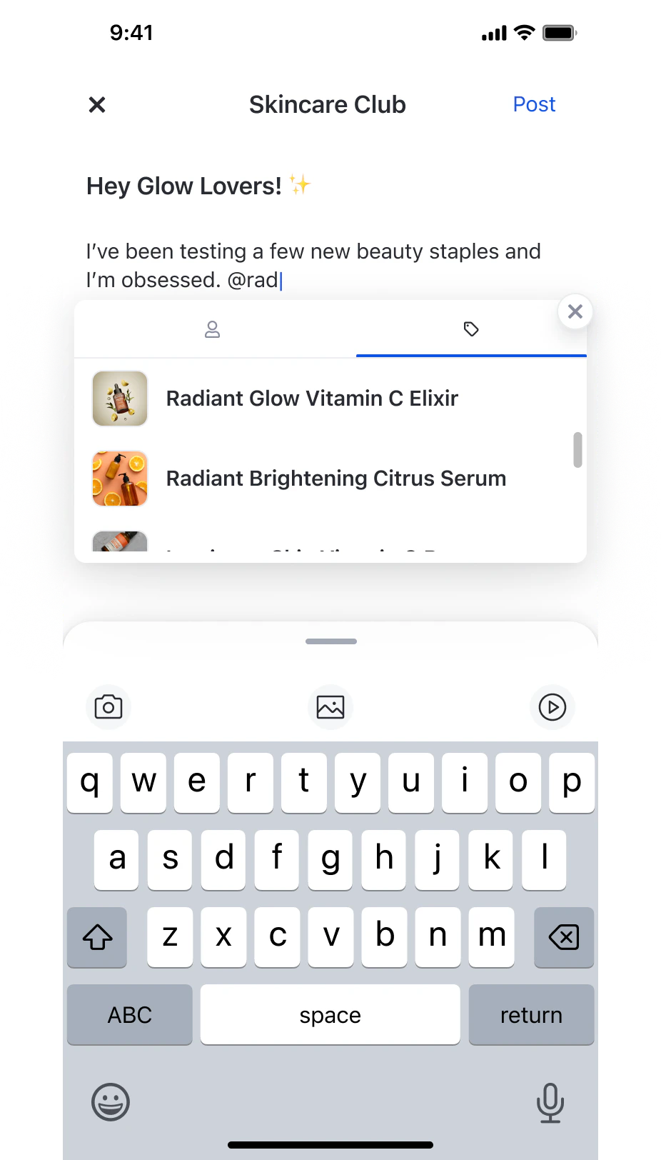 Product tagging requires the Product Catalog to be configured and enabled for your network in the console. The feature is available on iOS, Android, and Web only.
### How It Works
Type `@` in the post caption to trigger a suggestion overlay with a **Products** tab. Selecting a product inserts it as a single token — backspace removes the entire mention.
Each image or video in a post has its own tag entry point. Tap the tag button on a media item to open the product picker for that item.
All tagged products are displayed in a scrollable list below the post content — in both the feed and post detail view.
Tapping a product opens its link in an in-app browser, keeping users within the app.
### Limits & Constraints
| Limit | Value |
| --------------------------- | ------------------------------------------------- |
| Max products per post | 20 (combined across text mentions and media tags) |
| Max products per media item | 5 |
| Platforms supported | iOS, Android, Web |
### Components Used in Posts
Product tagging in posts uses two shared UIKit components. See [Product Tagging Components](/uikit/components/social/product-tagging) for full parameter reference and code examples.
| Component | Used for |
| ------------------------------ | ------------------------------------------------------------------------------------------- |
| `ProductTagSelectionComponent` | Searching and selecting products (via `create` or `edit` mode) |
| `ProductTagListComponent` | Displaying tagged products below post content (via `post`, `image`, or `video` render mode) |
The `ProductTagSelectionComponent` is opened from the Post Composer Page — either from the `@` mention flow in the text editor, or from the tag button on a media attachment. The `ProductTagListComponent` is rendered automatically within Post Detail and feed views when a post has tagged products.
## Related Features
**Content Display** Feed components for displaying and organizing posts
**Engagement Features** User interaction and engagement components
**Community Features** Community management and participation tools
**Commerce Integration** Shared UIKit components for product selection and display
Product tagging requires the Product Catalog to be configured and enabled for your network in the console. The feature is available on iOS, Android, and Web only.
### How It Works
Type `@` in the post caption to trigger a suggestion overlay with a **Products** tab. Selecting a product inserts it as a single token — backspace removes the entire mention.
Each image or video in a post has its own tag entry point. Tap the tag button on a media item to open the product picker for that item.
All tagged products are displayed in a scrollable list below the post content — in both the feed and post detail view.
Tapping a product opens its link in an in-app browser, keeping users within the app.
### Limits & Constraints
| Limit | Value |
| --------------------------- | ------------------------------------------------- |
| Max products per post | 20 (combined across text mentions and media tags) |
| Max products per media item | 5 |
| Platforms supported | iOS, Android, Web |
### Components Used in Posts
Product tagging in posts uses two shared UIKit components. See [Product Tagging Components](/uikit/components/social/product-tagging) for full parameter reference and code examples.
| Component | Used for |
| ------------------------------ | ------------------------------------------------------------------------------------------- |
| `ProductTagSelectionComponent` | Searching and selecting products (via `create` or `edit` mode) |
| `ProductTagListComponent` | Displaying tagged products below post content (via `post`, `image`, or `video` render mode) |
The `ProductTagSelectionComponent` is opened from the Post Composer Page — either from the `@` mention flow in the text editor, or from the tag button on a media attachment. The `ProductTagListComponent` is rendered automatically within Post Detail and feed views when a post has tagged products.
## Related Features
**Content Display** Feed components for displaying and organizing posts
**Engagement Features** User interaction and engagement components
**Community Features** Community management and participation tools
**Commerce Integration** Shared UIKit components for product selection and display